End of Module Evaluation
Throughout this module, I feel as if I have learnt a huge amount about the research and design process and the way in which contextual studies can reinforce design. I have put a lot of hard work into this context of practice module and I think overall it has paid off with what I have achieved.
For my initial research topic, I started looking at the value of Graphic Design and Advertising in East Africa (Uganda, Kenya, Rwanda, Burundi and Tanzania) before I travelled out to Uganda in the August - September 2013. Through this primary research I realised that the research topic needed refining down as looking at the whole of East Africa was too wide and broad spread. Before and while travelling, I read heavily into the history and culture of Uganda and also into the general subject of African art and crafts. This general research definitely informed my research process as I think it would have been difficult to write a dissertation on the topic without the general background research and understanding.
While in Uganda, I made observations on how globalisation and its history of British rule and colonialism has an impact on the design and advertising produced there. Also, the differences between design and advertising from the urban areas to the rural areas were definitely quite prominent in the photographic research I did. After returning from Uganda and organising the photographs I took, I decided to narrow down the topic to look at the impact that globalisation is having on design and advertising in Uganda, or more specifically the rural areas, while also looking at how the British rule and colonial period influenced the way the culture has grown. After I began researching into globalisation theories I soon realised that this was still a hugely broad topic and decided that to narrow it down to a topic where my own opinion and observations were relevant, it would be worth looking at the tourism industry within Uganda. This also matched up with my own personal design interests as I have completed a handful of different briefs and projects throughout my education on the subject of tourism design and expressing culture.
I have researched quite heavily into the Ugandan national identity, tourism in Uganda, design for tourism and tourism theories. Although, as I was not looking into this more specific topic while in Uganda, the primary research I have (other than visiting a number of tourism locations) was rather limited, so if I had the chance to do the module over again and visit Uganda again I would have narrowed my primary research down while I was there. However, I do feel as if I managed to gain a substantial amount of experiences, observations and information while in Uganda for the fact that I went out there with a very broad topic. Also, I do think I should have perhaps conducted more primary research in the form of surveys and questionnaires as I have a huge resource of other volunteers who have travelled from Britain to Uganda that I could have involved in my research. This would have strengthened the observations I made myself and introduced others' points of view.
Overall, I do think the practical project I produced and the written dissertation element were synthesised together and that the use of theory was evident in my rebrand of Crows Nest. I have definitely learnt more about how to use theory and critical analysis to aid the design process and I now understand more about how to synthesise theory to design. I now realise more of the importance of researching into the actual subject of the design and not just other work by other designers on the same subject. Once I got into the actual writing of the essay component, I did not really struggle with completing it as writing is one of my stronger points, but I also feel like through this module the design aspect was also successful. The grounding of the project in the theory gave me the confidence to simply apply what I had discovered through writing the dissertation onto the branding for a tourism location in Uganda, and I think it fully incorporated everything I discovered into the design and aesthetics.
Overall, this module has been an overwhelming learning curve and I'm happy with the level of research, both primary and secondary, that I managed to incorporate into both the written and practical elements. I now have a new appreciation for the research process and hope to incorporate this into all other areas of my work.
Context of Practice 3 - End of Module Evaluation
Crows Nest - Final Presentation Boards
These are the final presentation boards for the Crows Nest rebrand to support the Rebrand Proposal book and have been printed on A3 off white bulky newsprint to replicate more of the Ugandan design styles and methods of production.

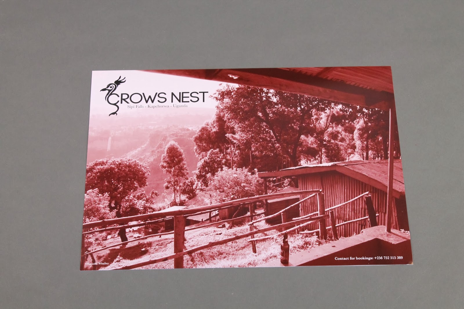


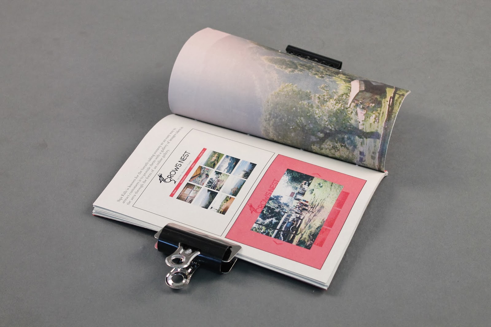


Crows Nest - Finished Printed & Bound Book
The book is finally now finished and bound!

I'm actually really happy with how this has turned out as I feel I've managed to get the theory into the practical in a way that explains and portrays the whole concept. The pages of the book were printed on off white sugar paper, and the front and back covers on red card stock. The binding was also successful and shows a more hand made style to the book, instead of having it perfect bound or with metal clips.
Just the last little bits of finishing off now and the whole module is coming together.
Crows Nest - Binding Proposal Book
Preparing a swatch of fabric to bind into the book to show the application of the aesthetics:


Japanese binding:

Crows Nest - Rebrand Proposal - Rationale
A growing trend within the tourism industry world wide is the search for cultural experiences, where a tourist aims to become exposed to and immersed in a new way of life for a brief period of time. In these instances, the tourist searches, often subconsciously, for as authentic an experience as they can find, and will travel out to a foreign country with preconceived ideas, as depicted to them by the media, of what to expect. Many tourism businesses utilise these predetermined notions to attract customers by providing the tourist with what they think is a true setting. A large majority of the time, these brands are generalised and in fact say nothing about the location whatsoever.
It has been noted that the design, aesthetics and brand identities of tourism companies can affect and influence the experience a tourist has. This can be seen as both a positive and a negative aspect of the brand. If a tourism business were to employ the use of more symbolisms and aesthetics that directly tie it to the location, take into account the impact a brand can have on the locals, and consider how it will transform the tourist’s experience, then it will be more successful overall.
As a country, Uganda is often seen as simply being ‘a part of Africa’ and visitors travel there expecting to see a generalised picture of Africa. This generalisation that the whole of Africa is the same detracts from the cultural touristic experience as Uganda has its own unique and deep rooted national cultural identity. There are many symbols and emblems that hold a strong meaning for Ugandans which mean nothing to people from other areas of the continent, and traditional customs which separate the Ugandan culture from other cultures.
In terms of tourism businesses in Uganda, Crows Nest is one which currently has little brand identity. This could be deduced as being more ‘authentically Ugandan’ but the business could benefit from capitalising on the symbolisms that could be brought in to create a brand for the company. By bringing in symbolisms to the brand identity, Crows Nest would stand out from its competition for being more accurately Ugandan, thus giving the visitor a more legitimate cultural experience.
This body of work, as presented in the Rebrand Proposal book, aims to present a possible rebrand for Crows Nest so it’s customers can receive a more authentic experience.
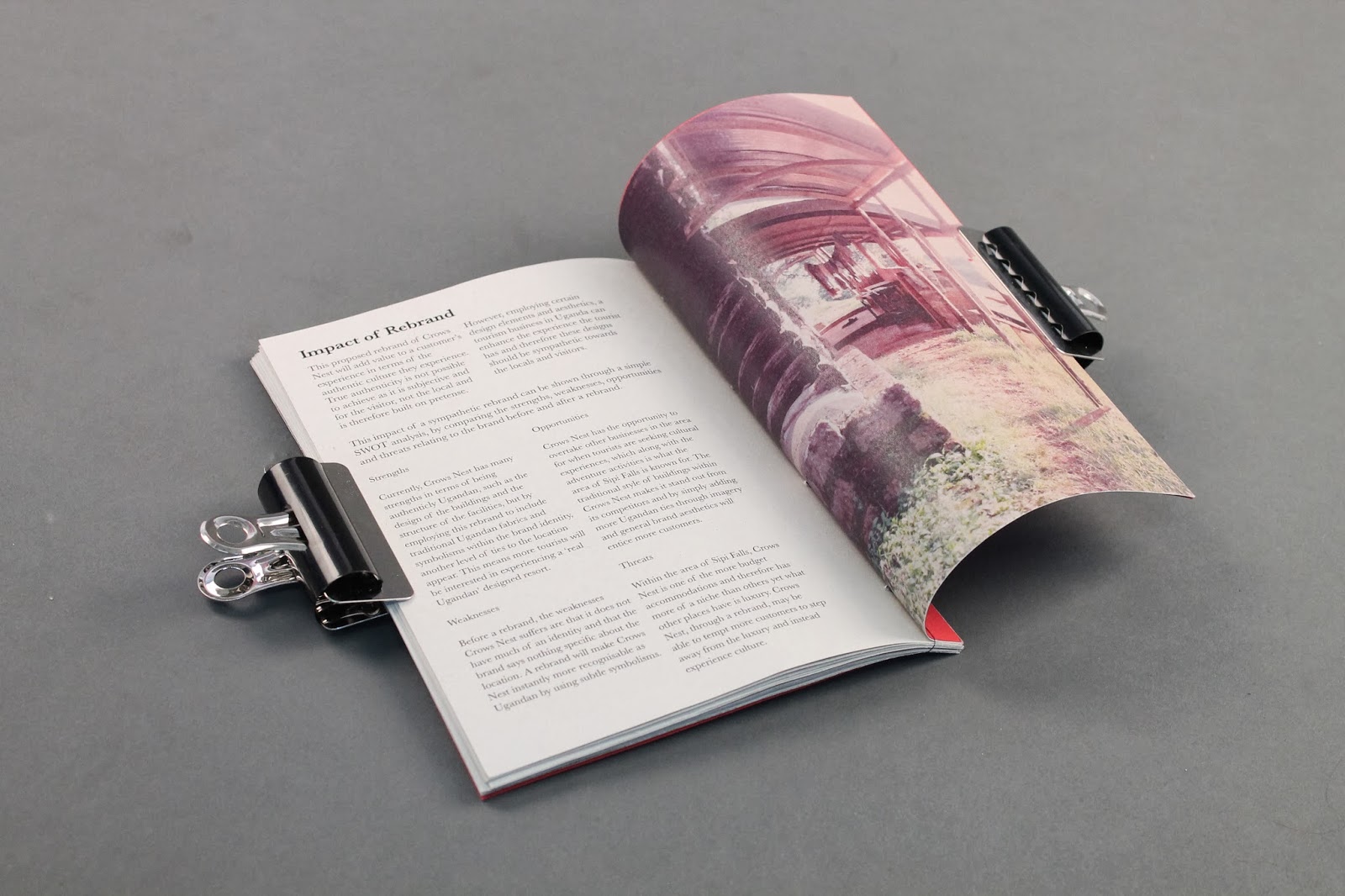
Crows Nest - Rebrand SWOT Analysis
(Taken from the Rebrand Proposal Book)
This proposed rebrand of Crows Nest will add value to a customer’s experience in terms of the authentic culture they experience. True authenticity is not possible to achieve as it is subjective and for the visitor, not the local and is therefore built on pretense. However, employing certain design elements and aesthetics, a tourism business in Uganda can enhance the experience the tourist has and therefore these designs should be sympathetic towards the locals and visitors.
This impact of a sympathetic rebrand can be shown through a simple SWOT analysis, by comparing the strengths, weaknesses, opportunities and threats relating to the brand before and after a rebrand.
Strengths
Currently, Crows Nest has many strengths in terms of being authenticly Ugandan, such as the design of the buildings and the structure of the facilities, but by employing this rebrand to include traditional Ugandan fabrics and symbolisms within the brand identity, another level of ties to the location appear. This means more tourists will be interested in experiencing a ‘real Ugandan’ designed resort.
Weaknesses
Before a rebrand, the weaknesses Crows Nest suffers are that it does not have much of an identity and that the brand says nothing specific about the location. A rebrand will make Crows Nest instantly more recognisable as Ugandan by using subtle symbolisms.
Opportunities
Crows Nest has the opportunity to overtake other businesses in the area for when tourists are seeking cultural experiences, which along with the adventure activities is what the area of Sipi Falls is known for. The traditional style of buildings within Crows Nest makes it stand out from its competitors and by simply adding more Ugandan ties through imagery and general brand aesthetics will entice more customers.
Threats
Within the area of Sipi Falls, Crows Nest is one of the more budget accommodations and therefore has more of a niche than others yet what other places have is luxury. Crows Nest, through a rebrand, may be able to tempt more customers to step away from the luxury and instead experience culture.