I decided that the most uniquely Ugandan symbol I could use to add to the brand identity is the Crested Crane, and as I'm trying to emphasise all of these design elements I think it is the perfect choice.
Grey Crested Crane:

Starting to jot down ideas:

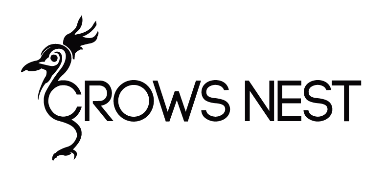
I had the idea to combine the shape of the bird in with the type and after some rough sketches was able to then trace this in Illustrator:

I added in a very Western, contemporary style typeface (it is based off a free download typeface called 'Code Bold') to the shape of the crane and produced this:


I have also chosen the colour scheme of the Ugandan flag due to what each colour is said to represent and that it is the same colours as the current hand painted sign outside Crows Nest. I will bring yellow into the brand in other ways but the signage and other elements will work in black and red.